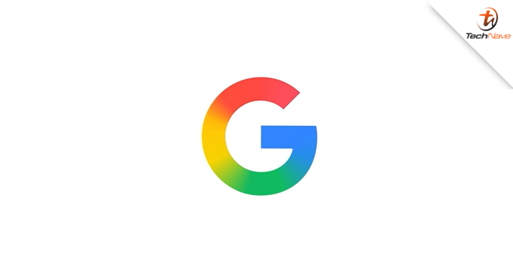
Recently, Google officially adopted a new logo across all of its products. The logo, with a gradient warrant incorporating the company's four official colours, was first shown in May. So, what should you know about it?
A fresher look for the brand
For your information, the new logo visually symbolises the company's evolution in the AI era. While the original four colours are retained, the brighter hues and gradient design symbolise the surge in AI-driven innovation and creative energy across their products and technologies.
Interestingly, this is the sixth time the company's logo has been given a new look since Google was founded in 1997. So, it will be interesting to see what the logo could look like in the future.
Did this news catch your attention? Stay tuned for more news like this at TechNave!


COMMENTS