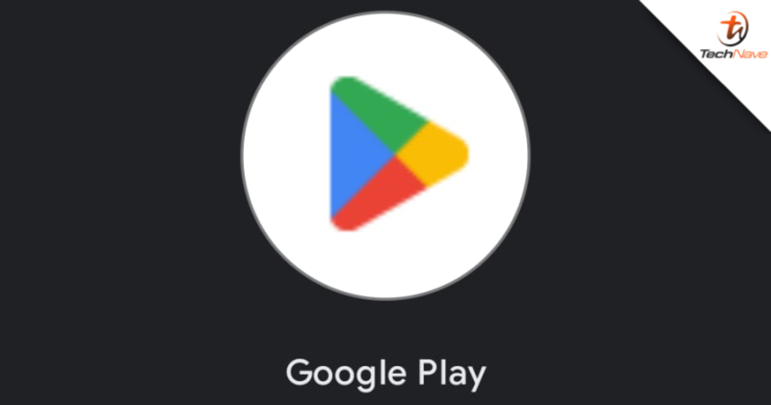
It seems that all the major tech companies have been updating their app or platforms’ icons recently and Google is no exception. Fresh from updating its Chrome web browser icon, the Android de facto app store, the Google Play Store has also discreetly received a refresh recently.
At first glance, the new icon may look the same but a closer look will show some minor changes from its previous iteration. The triangular design with the yellow, green, red and blue colour blocks remains but the corners are more rounded.
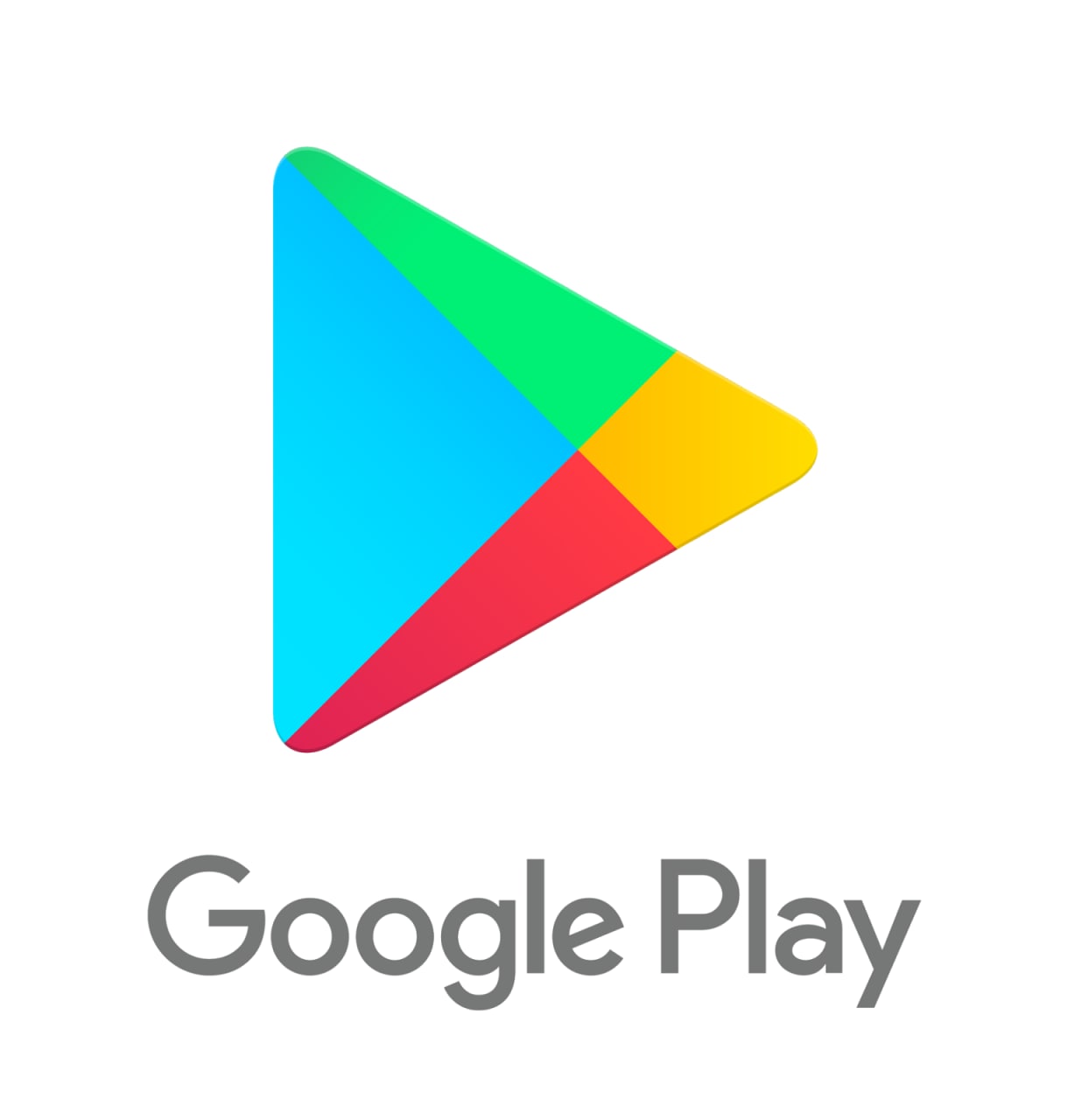 The old Google Play Store icon that we've grown accustomed to.
Furthermore, the colours themselves are also now a shade darker. No official reason has been given by Google as to why it has updated the Play Store icon and the new logo has already gone live.
This marks the first change to the look of the icon since 2016. If you haven’t gotten the new icon on your devices yet, it may be there soon as the change may take quite some time to fully be rectified in all devices.
So, what do you guys think of the new Play Store icon? Share your thoughts with us in the comments below.








COMMENTS