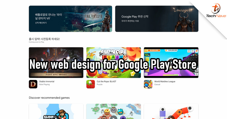
If you visit the Google Play Store, you probably won't notice anything wrong with it. But many have long considered the website design as outdated and have been calling for a redesign. Now, we're finally getting a glimpse of a new design.
According to Android Police, the redesigned Google Play Store website now looks more like the Play Store mobile app. The first thing you'll notice is that the left menu is no longer there. Instead, the main categories - Games, Apps, Movies, and Books - are now tabs on the top of the page. You'll then see larger thumbnails of highlighted content at the top.
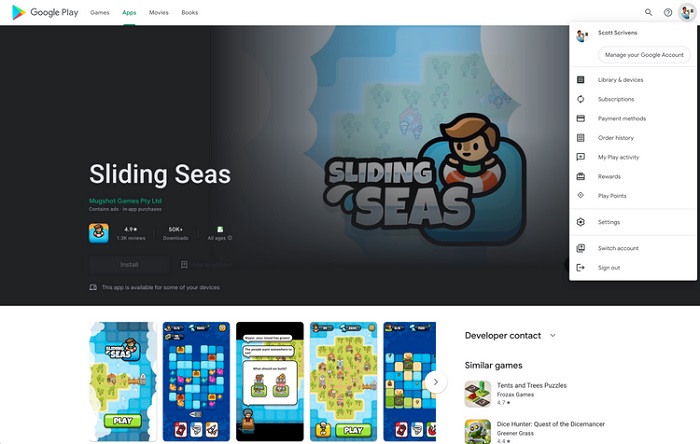
Some apps now have large banners and auto-play trailers
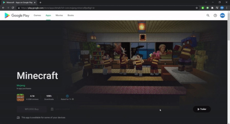
If you pick an app or content, you'll find that the info page also looks different. There's now a big banner for most content, and some games will have trailers that will play automatically. However, the description area and screenshot carousel didn't seem to have changed.
In my opinion, this design could still use some improvement. The individual app pages still look too cluttered to me, but what are your thoughts on that? Let us know in the comments, and stay tuned to TechNave for more news like this.
COMMENTS