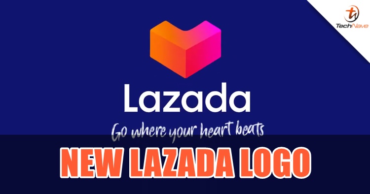
As you probably have noticed by now at your mobile phone, Lazada has changed its logo but it's not just for a promotional period, but rather as a new campaign called "Go Where Your Heart Beats". It's Lazada's first new look since five years ago and the purpose for this is to "to accelerate South East Asia progress through commerce and technology".
According to Lazada, they wanted the new logo to reflect a more youthful, energetic and dynamic look and feel. Obviously, this is aiming at the new generation for the digital age, and if you look closely, the heart shape is made out of a big L letter block with a new palette of colours that represents the so-called "vibrancy of shopping". This is what Lazada Group Chief Marketing Officer Mary Zhou has to say about the new marketing direction:
“As South East Asia’s leading eCommerce platform by scale and by reach, we are capturing the heartbeat of the region by observing how they behave, engage with and respond to our platform. At the same time, we are contributing to the heartbeat of South East Asia as eCommerce pioneers constantly redefining the online shopper and seller experience through innovative features and tools." she said.
In conjunction with that, the new campaign also features three 30-second videos of three different characters with their own personal pursuit made possible through Lazada. You can check them out above.
The refreshed brand campaign was conceptualised and developed by Wunderman Thompson Singapore while the brand identity was developed by Superunion Singapore. Stay tuned for more Lazada news at TechNave.com.


COMMENTS