When Nothing unveiled its first headphone and latest smartphone earlier in July, opinions on them were mixed. Some loved the Nothing Headphone (1) for its nostalgic cassette tape look and the Nothing Phone (3) for being different. Others found the headphone's shape unusual, while the Phone (3) was declared "ugly" by popular techtuber MKBHD.
So, is Nothing staying true to its philosophy of being different a good idea? There's no objectively 'correct' answer here (in our opinion). But since Nothing has a solid niche in Malaysia, it would be good to hear more from you readers. To start, here's my take on the company's two latest products.
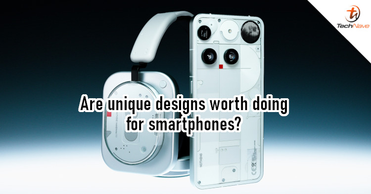
Nothing Headphone (1) - Being different, the right way
If you grew up in the 90s, the Nothing Headphone (1) would probably resonate with you. Its rectangular shape and the transparent part really remind me of cassette tapes, which fits with the music theme. It's a unique design that looks different without being obnoxious or too weird, so it feels like the designers knew what they were doing. If you wear this on the streets, you'll definitely turn some heads.

The Nothing Headphone (1) looks interesting in a way that's not off-putting
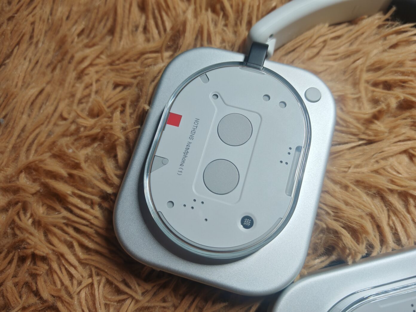
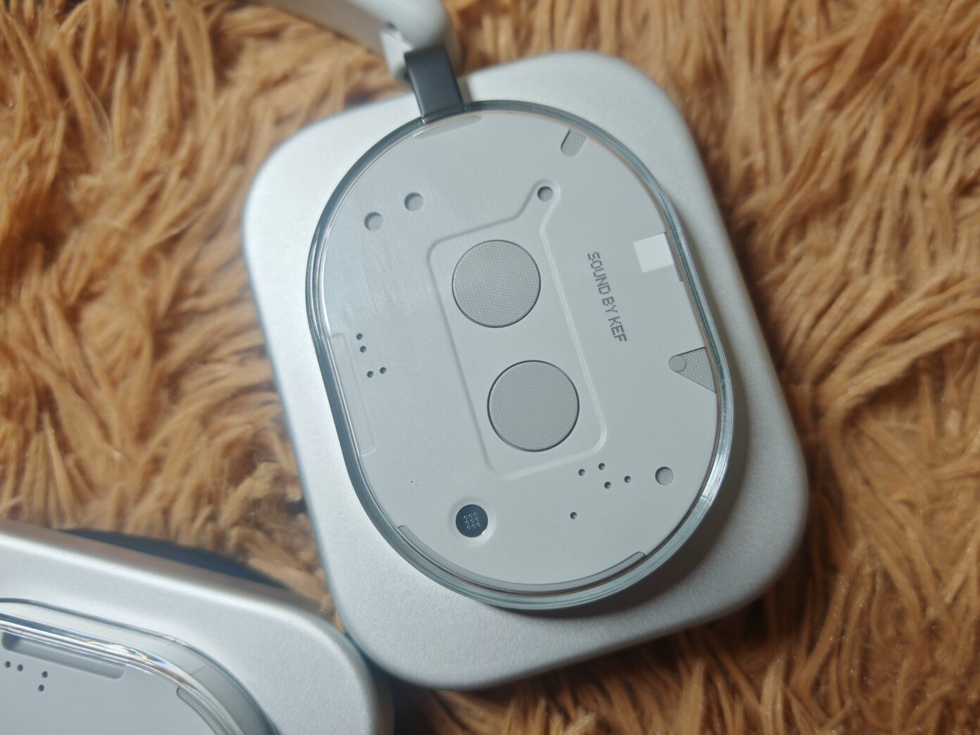
Of course, the design isn't the only thing I like. It also helps that Nothing's new headphone is surprisingly comfortable, with an extendable headband that's nicely padded and soft, comfortable earpads. The size is just right for me, sitting snugly without feeling like it would fall off easily. It also allows for some adjustment, so most people should be able to wear it with no issues.
The build quality for the Nothing Headphone (1) is also excellent. It features an aluminium body, soft leather paddings, and an overall premium construction. Although it can feel a bit heavy for a headphone of this size, it doesn't feel uncomfortable even when worn for long hours. Of the two new Nothing products, this is definitely the one I would consider well-designed.
Nothing Phone (3) - A design not appreciated by some
In contrast, we have the Nothing Phone (3), the company's first flagship-class smartphone. Leaks of the new phone started appearing in June, so many people already knew what it would look like before it launched. Although slightly smaller than the mid-range Nothing Phone (3a) Pro, the Nothing Phone (3) has the same shape and colour options. Unlike the other Nothing phones, this one loses the Glyph LEDs in exchange for a Glyph Matrix display.
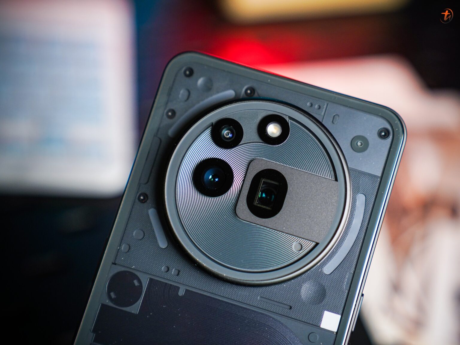
Honestly, the Nothing Phone (3) is a head-turner in its own way. Having said that, opinions on it have been polarising. As said, some people didn't mind it; it's interesting and unique enough to warrant attention. On the other hand, others had more negative opinions on the phone's design. Its rear layout is certainly unorthodox, with its non-aligned camera and the Glyph Matrix occupying a solid chunk of the top-right.
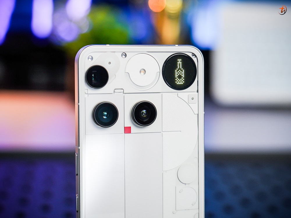
The back of the Nothing Phone (3) is what many are not fans of
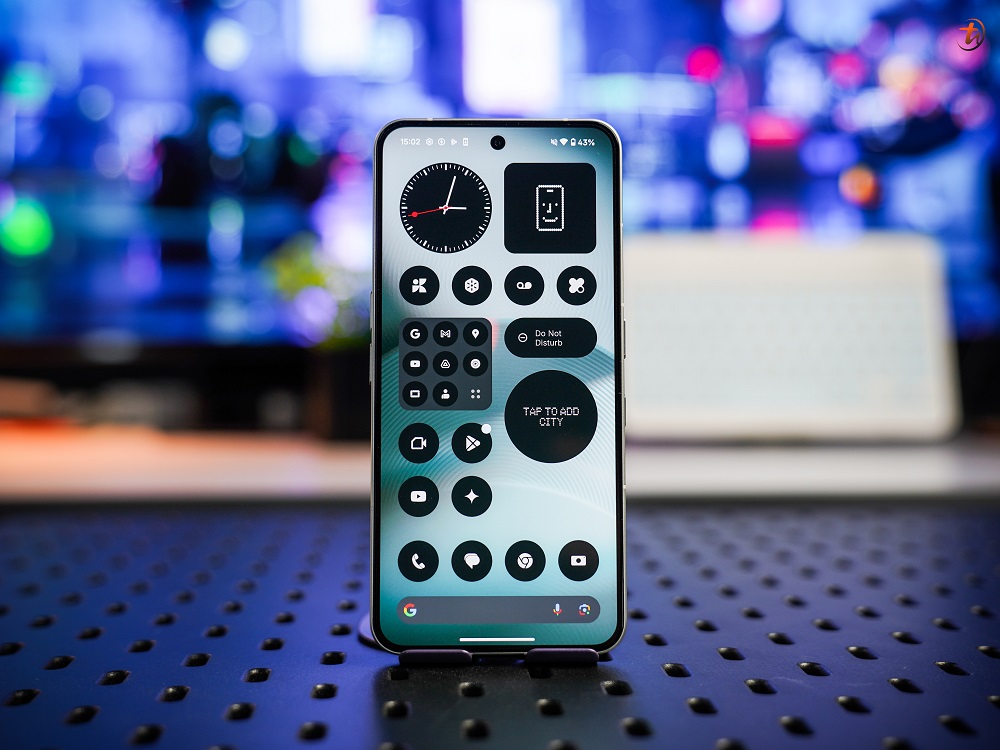
The front is fine, however, and NothingOS remains amazing if you like clean UIs
Aside from that, the Nothing Phone (3) is everything you'd expect from a flagship smartphone. It's well-built, feels premium, delivers solid performance, and has some great features. Its RM3299 price tag may feel a bit pricey considering the competition, but that's a costing issue (a whole different can of worms) and not a design one. In other words, there's nothing really wrong with this phone.
To be unique, or not to be?
In a market of cookie-cutter builds and designs, Nothing stands out for its bold and unique designs. It hasn't and probably won't always work out for the better, as seen with the case of the Nothing Phone (3). But like it or not, you can't deny that the phone would turn heads and be immediately identified by tech enthusiasts from its looks alone.
If you ask me, the Nothing Phone (3) and Nothing Headphone (1) both did well in one aspect - drawing attention and keeping it. Content creators have been talking about both devices, perhaps more than most devices at launch. In that sense, the design of both devices has been successful. Whether you like them or not, however, is completely up to you.
Nothing has proven that its designs can stand out and catch the eye
To be honest, we would have liked to see a bit more continuity from the preious generation Glyph LEDs design. This is because the circular Glyph Matrix doesn't seem to carry the same design language at all. However, there were just as many users who were skeptical or didn't like the Glyph LEDs for the Nothing phones when it first came out.
Now that the two new Nothing devices have been out for some time, what do you think of their designs? Have you grown to like them, or don't think they're your cup of tea? Let us know in the comments below and stay tuned to TechNave for more articles like this.


COMMENTS