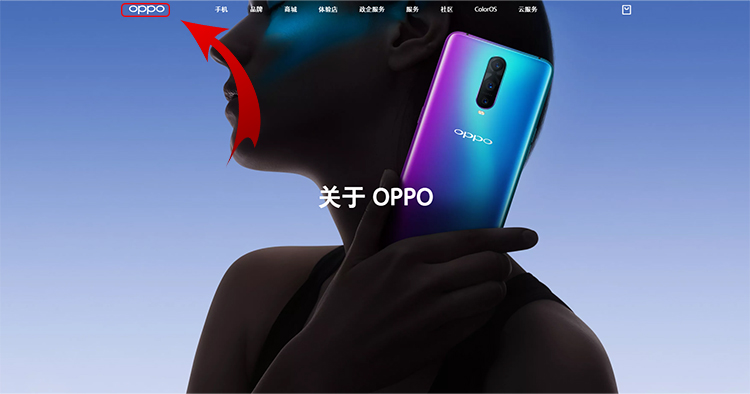
A change has been made to OPPO’s logo and it's a pretty big change. White font and consistently shaped lettering is the approach the company took at their new logo. The company showed off their new logo during their announcement of their brand new Reno line.
So far, we can only find the logo on the Chinese website. The new logo has not been seen yet on all other regional websites (including Malaysia) and their social media accounts so its unclear whether this logo will only be for China or the rest of the world would follow suit.
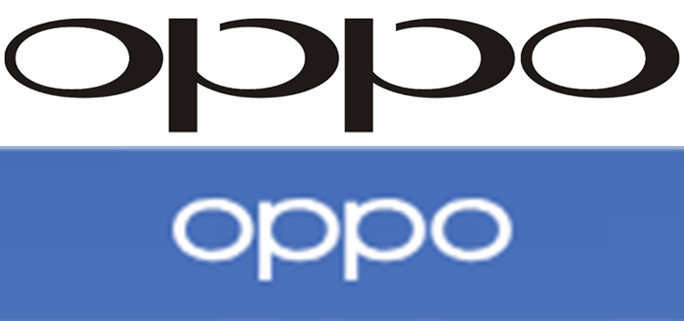
Check out the font differences between the two logos. Old logo on top and new at the bottom.
Personally, I’m not a fan of ther new logo. Its boring, bland, and lost their creative edge with the interesting lettering. They don’t stand out like they used to, in my opinion. Anyways, let us know what you think of the logo. Want more smartphone news? Check out TechNave.com!


COMMENTS