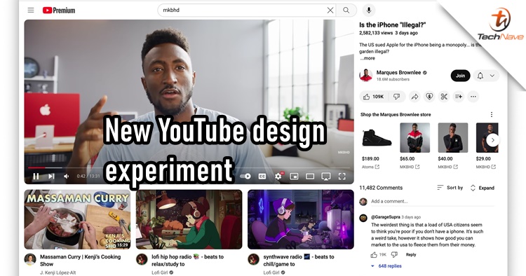
It seems that YouTube is testing out some new user interface outlooks for its website. Sometimes, a few YouTube users will get a first look at new designs and apparently, the latest one didn't receive a good reception.
As you can see on the thumbnail and the screenshots below, the video title, video description and comments have been relocated to the right side of the page, whereas recommended videos have switched place to below the YouTube video player. This change is not permanent but it's not sitting too well with users.
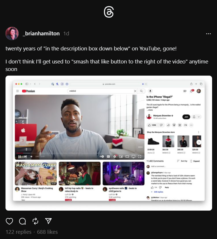
new youtube UI with the suggestions at the bottom is so cluttered pic.twitter.com/okEkHA2HwT
— Ananay (@ananayarora) April 10, 2024
jumping in! it sounds like you’re seeing an experiment/test feature. diff teams at YouTube often test new ways to improve features & experiences. you can share your feedback here: https://t.co/NnQpe4fbHH also, you can check out recent experiments here: https://t.co/p3uu6MOOr2
— TeamYouTube (@TeamYouTube) April 10, 2024
In response to one of the screenshots shown on Twitter X, YouTube said that this new design is an experiment/test feature. With that, a feedback page was also given which you can visit too if you happen to see the new design. The official feedback link is right here.
Since the design is not final, YouTube is unlikely to proceed with this due to the negative feedback. But what do you think? Let us know in the comments below and stay tuned for more trending tech news at TechNave.com.
COMMENTS