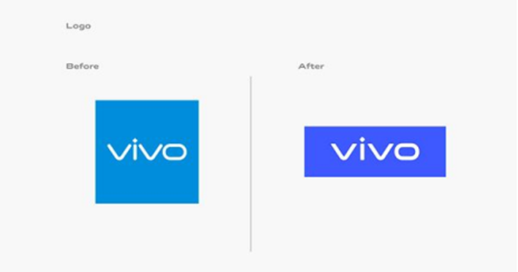
So here's a new update, just recently - vivo has updated its brand identity and although it's not that different from the previous one, the company hopes that this new look will appeal to the global audience as the leader in the tech and lifestyle industry.
Using the colour blue Pantone 2386, this was designed by renowned Danish designer Bo Linnemann to reflect the "forward-looking spirit" with a more saturated shade of blue. According to vivo, this is to "better understand consumer visual habits and their visual receptiveness to digital displays" and be more soothing to the eye. On top of that, the English and Chinese language VivoType font are also designed by Bo Linnemann and Chinese calligrapher Qiu Yin respectively.
“Through the new branding, we hope to redefine the brand's positioning in technology and innovation and express our brand vision of ‘enjoying the extraordinary’ with young consumers around the world through Vivo’s unique visuals and creative spirit,” said Spark Ni, Senior Vice President of vivo.
Cool story, bro. Stay tuned for more vivo news only at TechNave.com.

COMMENTS