News & Reviews: new logo
-
Sep 30, 2025
Recently, Google officially adopted a new logo across all of its products. The logo, with a gradient warrant incorporating the company's four official colours, was first shown in May. So, what should you know about it?
[ Read More ] -
Oct 19, 2023
Today, CelcomDigi Berhad unveiled its new corporate logomark. As you can see from the thumbnail above, it looks like a butterfly with a mixture of yellow and blue. From the words of the company, the new logo represents "a manifestation of the company’s aspiration to be their customers’ and the nation’s trusted partner in innovation and digitalisation".
[ Read More ] -
Oct 06, 2020
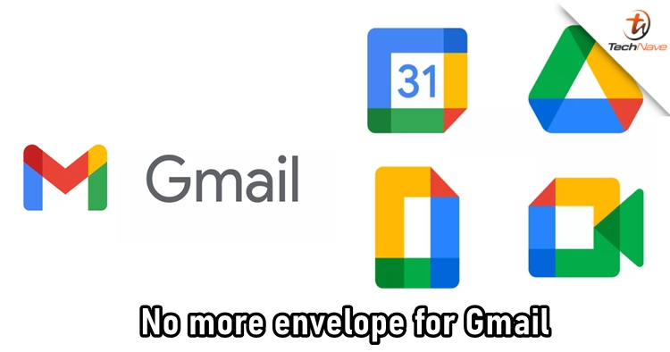
After years of seeing the envelope icon, Google has announced that a newly designed logo will be replacing the old one for Gmail. The Gmail logo is now more well-matched to other Google services by having the core Google colours which are blue, yellow, and green. Not only the logo change, but the tech giant has revamped G Suite as well to take a chance against Microsoft Office.
[ Read More ]